“Upward,” “Limitless” and “Sweet Embrace” offer optimistic outlook for 2024 finishing trends
Get ahead with this color forecast
Finishing forecasts predict an optimistic outlook expressed in calming, comfortable, cozy shades. Softly tinted hues lead the 2024 color palettes, reflecting the trend toward warmer, less saturated colors. With names like “Upward” by Sherwin-Williams, “Limitless” by PPG and “Sweet Embrace” by AkzoNobel, these colors are intended to soothe and inspire us, conveying a sense of peace and well-being.
More on the colors of the year
- Upward presents a “breezy, blissful blue” appearance with an undertone of violet. Sherwin-Williams describes the color as a “tranquil and uplifting blue-gray that encourages boundless creativity. This color of classic comfort speaks to a desire for personal progress and peace—an outlook and effort that allows us, individually and together, to move up and rise above—ever ascending.”
- Limitless offers a honey beige shade that PPG noted “contains both the power of a primary and the essence of a neutral.” Ashley McCollum, PPG marketing manager and global color expert for architectural coatings, added, “In the architectural space, we anticipate that it will rapidly become one of newest neutrals due to its versatility.”
- Sweet Embrace delivers a pastel pink shade that AkzoNobel said was “inspired by soft feathers and evening clouds that contributes to create a calm and welcoming environment.”
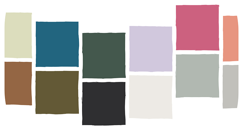
Color Palette Collections
To expand on their Colors of the Year, coatings manufacturers curate palettes with dozens of complementary hues. PPG pairs its signature Limitless with floral pinks, juicy violets, spicy reds, chocolatey browns, rooted garden greens and a broad range of blues.
The Sherwin-Williams 2024 Colormix forecast organizes its selected colors into four overarching trends:
- The convergency of blues and greens aiming to promote a sense of calmness and reduced stress
- Reds and purples designed to instill an atmosphere of creative expression and freedom
- Deep and dark colors serving up a bold modern vibe of artistry and individuality
- A study in delicate tints and their interplay with light to promote harmonious spaces
According to Sue Wadden, director of color marketing at Sherwin-Williams, trends toward warmer colors coincide with the rising popularity of earth-aligned browns, mixing in red and purple to create an atmosphere of groundedness and balance.
Aligning with the purple-infused pink of Sweet Embrace, AkzoNobel shares its complementary collections as three color stories:
- A warm color story—reminders of home, a place that feels comfortable and safe by combining shades of stone, soil and terra cotta clay.
- A calm color story—evoking thoughts of nature by bringing together the soft greens and blues of the woods and the sea.
- An uplifting color story—Joyful colors, inspiring imagination and creativity with dreamy lilacs, fluid grays and modern yellows.
These immersive, softer, warmer hues provide a comfortable canvas to envelop and accent our residential, commercial and institutional buildings. Look for 2024 color trends to reflect individualized, yet inclusive expression, remaining welcoming and considerate of our neighbors.